
Latest news from Edgeworks Creative and some of the things we find from around the web.
| Edgeworks Product | 9 |
| Content Creation | 4 |
| SEM | 11 |
| Design | 11 |
| Instructional Design | 3 |
| Props | 218 |
| Alphabet Soup | 33 |
| Creative Collaboration | 1 |
| Website Ownership | 5 |
| Services | 5 |
| Client Website | 29 |
| Edgeworks Office | 18 |
| Marketing | 18 |
| AI Assisted Post | 1 |
| SEO | 10 |
| This Day in History | 1 |
| Branding | 1 |
| Book Review | 1 |
| Q&A | 3 |
Click Here! Read More! In this Alphabet Soup we look at CTA or Call To Action.
For inbound marketing a CTA is the last pitch to engage your visitor to take an action that you count as a conversion. This could be making a purchase, calling your phone number, signing up for your email list, viewing the next post, or more. The CTA is the last opportunity to convince a user to perform an action.
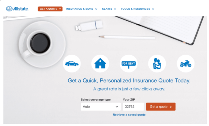
The most common CTAs are easily recognized: "buy now","learn more","read more","subscribe","get started", and more.
A Call To Action needs to tell a person what to do, and also give them reason to do it. A CTA is a collaboration of words and imagery including the color, size and shape of a button if one is used. Additional text is often placed near the CTA button, especially if one of the common CTAs are used. Use of contrast and whitespace can play a huge role in the effectiveness of a CTA.
Use a strong command or action verb at the start of your Call to Action. If you are promoting your email newsletter signup form then "subscribe" is a good choice, while "buy", "shop" and "order" are string commands good for an ecommerce conversion action.
A CTA needs to convince a user and for this we look at the usual suspects of FOMO and generating enthusiasm. Savings and special deals always appeal.
While the short CTA is generally considered better, there is no rule saying that you can't use longer phrases or distinct wording, especially if the words strongly support your branding.
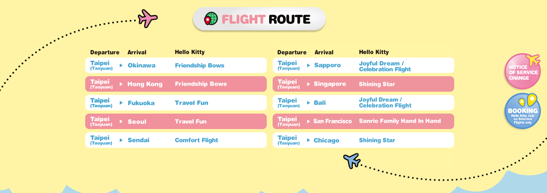
The flipboard of flights for Eva Air - better known as the Hello Kitty airline - couples with the book now button to maintain on-point branding with the always-present floating button.
When it comes to email marketing some like to think of the subject line as the CTA with the conversion being an email open.
Understanding which CTA might work best for your offer and audience can be learned with A/B testing. Remember to test only one thing at a time - color, text, font size - each of these is a distinct change that may have an impact on your conversion rates.
Get in touch when you're ready to test new CTAs for your website!


